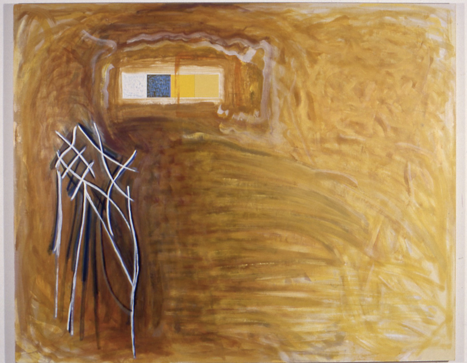
Lightness, 1998 and Space in the Forest, 1997

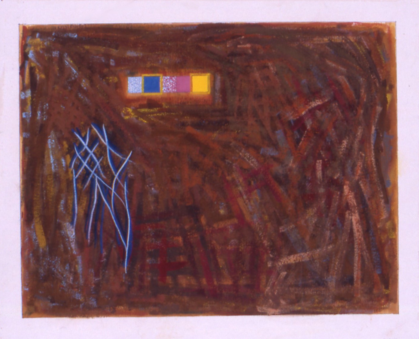
Studies for Lightness and Space in the Forest


Lightness (1998) and Space in the Forest (1997) are worth comparing because one is about an open space and the other a contained one. Both are atypical in regard to the rest of my work (except for some very early paintings) in that much of the painting is in response to the row of squares, which are themselves not as precisely located in regard to the rectangle as a whole (the stretcher) as would normally be the case. Also, they float or hover in, and as much as, the rest of the painting. Lightness is thinly painted, filled with air and clarity of a sort, Space more thickly painted and made of colors that belong to depths that are of uncertain limit.
Lightness is made out of distinct brush marks, while in the linear cluster at the lower left, which is made out of lines that you can’t see as stationary, the lines are painted over other lines so that they have a density that nothing else in the painting has, they are more substantial while being just as mobile as the rest of the what makes up the surface. Space is made of two spaces of uncertain depth. The vertical blue one on the left and a brown one which runs from top to bottom in the middle of the rest of the painting (four-fifth of the width of the whole,) and is defined and surrounded by gestural movement. In Lightness the color is just this side of naturalistic, it’s as much the color of paints as of anything roughly like that, for example the desert. Space is made out of the colors of the forest.
In both the row of squares is both in the painting and not, framed and secured by wavy strokes in Lightness but for the most part almost outside of the painting in Space, except for the blue square which I think does the opposite and sinks into the blue. They are paintings where I stretch the limits of the idea of abstraction in the way I did in the Village Group, but which is messier in that they go further than did the latter to bring those references to perceiving things in nature closer to the immediacy of what’s on the canvas in some way that is neither on nor in, out of which most of my work is made.
They are in this respect works where the pictorial comes into direct contact with its opposite. What’s in my view interesting or successful about them is not that, which is just what it is, it’s that neither painting is either contained or cropped by the rectangle which is its stretcher, and is seen as a space which hovers on top of the perimeter which surrounds it, while at the same time being much deeper and uncertain.